Musical genre is far from black and white - there are no hard and fast rules for classifying a given track or artist as “hard rock” vs. “folk rock,” but rather the listener knows it when they hear it. Is it possible to classify songs into broad genres? And what can quantitative audio features tell us about the qualities of each genre?
Exploring Spotify's audio features
The Spotify Web API provides artist, album, and track data, as well as audio features and analysis, all easily accessible via the R package spotifyr.
There are 12 audio features for each track, including confidence measures like acousticness, liveness, speechiness and instrumentalness, perceptual measures like energy, loudness, danceability and valence (positiveness), and descriptors like duration, tempo, key, and mode.
It’s likely that Spotify uses these features to power products like Spotify Radio and custom playlists like Discover Weekly and Daily Mixes. Those products also make use of Spotify’s vast listener data, like listening history and playlist curation, for you and users similar to you. Spotify has the benefit of letting humans create relationships between songs and weigh in on genre via listening and creating playlists. With just the quantitative features, is it possible to classify songs into broad genres? And what can these audio features tell us about the qualities of each genre?
We'll look into a sample of songs from six broad genres - pop, rap, rock, latin, EDM, and R&B - to find out.
You can find the full Github repo here. Header image by NeONBRAND via Unsplash.
TL;DR:
Decision tree, random forest, and XGBoost models were trained on the audio feature data for 33,000+ songs. The random forest model was able to classify ~54% of songs into the correct genre, a marked improvement from random chance (1 in 6 or ~17%), while the individual decision tree shed light on which audio features were most relevant for classifying each genre:
Rap: speechy.Rock: can’t dance to it.EDM: high tempo.R&B: long songs.Latin: very danceable.Pop: everything else.
Rap was one of the easier genres to classify, largely thanks to the speechiness feature. Low danceability helped separate out rock tracks, and high tempo provided the distinction needed to find EDM songs. R&B, pop, and latin songs were most difficult to sort out, but R&B songs tended to be longer in duration, and latin songs were slightly more danceable than pop tracks.
Getting the data
Genres were selected from Every Noise, a fascinating visualization of the Spotify genre-space maintained by a genre taxonomist. The top four sub-genres for each were used to query Spotify for 20 playlists each, resulting in about 5000 songs for each genre, split across a varied sub-genre space.
You can find the code for generating the dataset in spotify_dataset.R in the full Github repo.
playlist_songs <- read.csv('genre_songs_expanded.csv',
stringsAsFactors = FALSE)
# refer to spotify_dataset.R for how this dataset was generated

glimpse(playlist_songs)

Observations: 33,179
Variables: 23
$ track.id                 <chr> "6f807x0ima9a1j3VPbc7VN"…
$ track.name               <chr> "I Don't Care (with Just"…
$ track.artist             <chr> "Ed Sheeran", "Zara Lars"…
$ track.popularity         <int> 68, 72, 69, 74, 70, 69, …
$ track.album.id           <chr> "2oCs0DGTsRO98Gh5ZSl2Cx"…
$ track.album.name         <chr> "I Don't Care (with Just"…
$ track.album.release_date <chr> "2019-06-14", "2019-07-0"…
$ playlist_name            <chr> "Pop Remix", "Pop Remix"…
$ playlist_id              <chr> "37i9dQZF1DXcZDD7cfEKhW"…
$ playlist_genre           <chr> "pop", "pop", "pop", "po"…
$ playlist_subgenre        <chr> "dance pop", "dance pop"…
$ danceability             <dbl> 0.748, 0.675, 0.493, 0.5…
$ energy                   <dbl> 0.916, 0.931, 0.773, 0.7…
$ key                      <int> 6, 1, 5, 5, 2, 8, 7, 1, …
$ loudness                 <dbl> -2.634, -3.432, -3.791, …
$ mode                     <int> 1, 0, 0, 1, 1, 1, 1, 0, …
$ speechiness              <dbl> 0.0583, 0.0742, 0.1570, …
$ acousticness             <dbl> 0.10200, 0.07940, 0.4290…
$ instrumentalness         <dbl> 0.00000000, 0.00002330, …
$ liveness                 <dbl> 0.0653, 0.1100, 0.0807, …
$ valence                  <dbl> 0.518, 0.613, 0.301, 0.7…
$ tempo                    <dbl> 122.036, 124.008, 123.14…
$ duration_ms              <int> 194754, 176616, 193548, …
playlist_songs %>%
count(playlist_genre) %>%
knitr::kable()| playlist_genre | count |
| edm | 6028 |
| latin | 5035 |
| pop | 5612 |
| r&b | 5761 |
| rap | 5645 |
| rock | 5098 |
Exploring audio features by genre
Overall, the songs in the dataset tend to have low acousticness, liveness, instrumentalness and speechiness, with higher danceability, energy, and loudness. Valence varies across genres.
feature_names <- names(playlist_songs)[12:23]

playlist_songs %>%
  select(c('playlist_genre', feature_names)) %>%
  pivot_longer(cols = feature_names) %>%
  ggplot(aes(x = value)) +
  geom_density(aes(color = playlist_genre), alpha = 0.5) +
  facet_wrap(~name, ncol = 3, scales = 'free') +
  labs(title = 'Spotify Audio Feature Density - by Genre',
       x = '', y = 'density') +
  theme(axis.text.y = element_blank()) +
  scale_color_kp(palette = 'mixed')
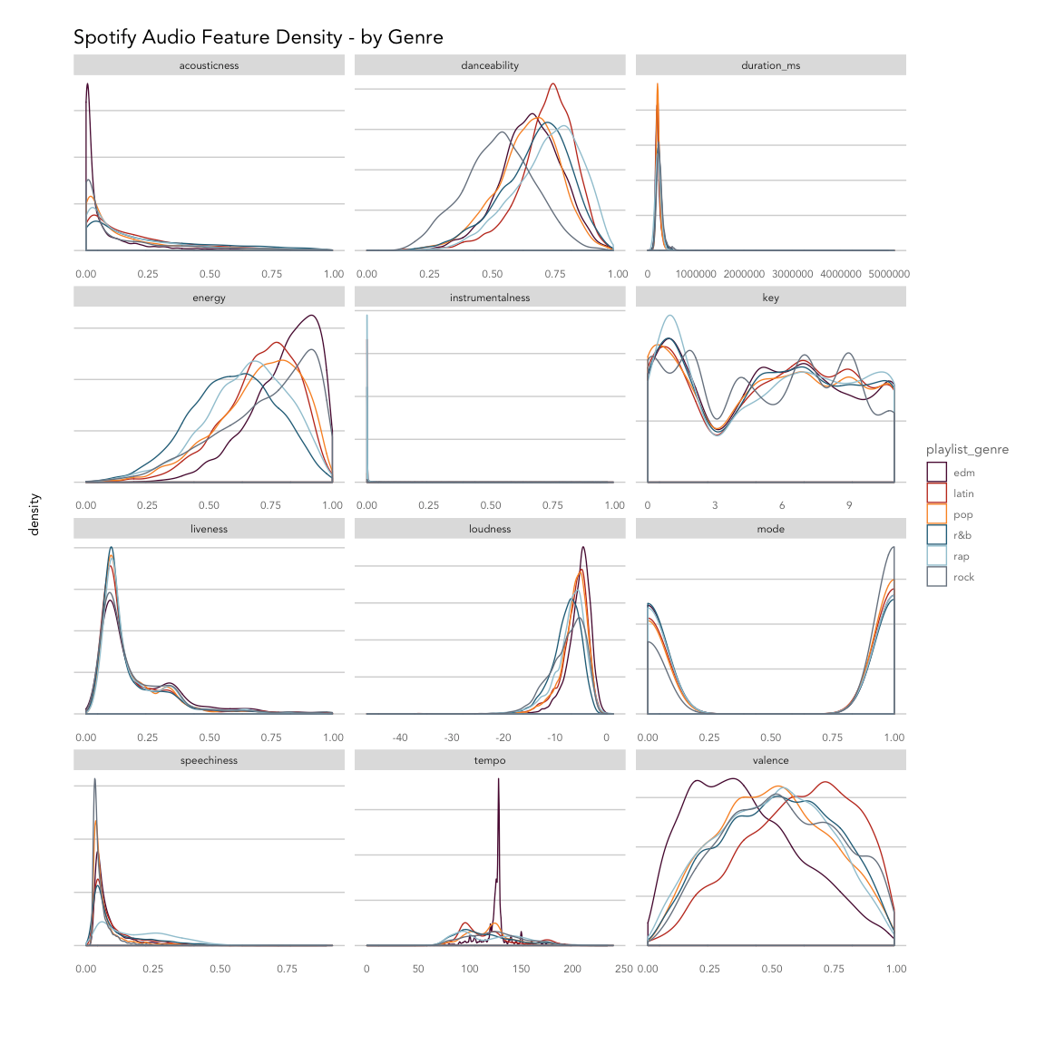
Breaking things out by genre, EDM tracks are least likely to be acoustic and most likely to have high energy with low valence (sad or depressed); latin tracks have high valence (are positive or cheerful) and danceability; rap songs score highly for speechiness and danceability; and rock songs are most likely to be recorded live and have low danceability. Pop, latin and EDM songs are more likely to have shorter durations compared to R&B, rap, and rock.
Based on the density plot, it looks like energy, valence, tempo and danceability may provide the most separation between genres during classification, while instrumentalness and key may not help much.
Removing outliers
There are clearly some outliers in duration that may skew analysis. Using the boxplot function, we can isolate any values that fall outside of a given range. The default range is the interquartile range, or the spread from the 25th to 50th percentile. Because a lot of values fall outside of that range, we can widen it by incrementing the range parameter. Here we've used range = 4, which multiplies the interquartile range by 4 to widen the spread of values we'll consider not be outliers.
with_outliers <- playlist_songs %>%
  ggplot(aes(y = duration_ms)) +
  geom_boxplot(color = kp_cols('red'), coef = 4) +
  coord_flip() +
  labs(title = 'Duration')

duration_outliers <- boxplot(playlist_songs$duration_ms,
                             plot = FALSE, range = 4)$out

playlist_songs_no_outliers <- playlist_songs %>%
  filter(!duration_ms %in% duration_outliers)

without_outliers <- playlist_songs_no_outliers %>%
  ggplot(aes(y = duration_ms)) +
  geom_boxplot(color = kp_cols('red'), coef = 4) +
  coord_flip() +
  labs(title = 'Duration, outliers removed')

gridExtra::grid.arrange(with_outliers, without_outliers, ncol = 1)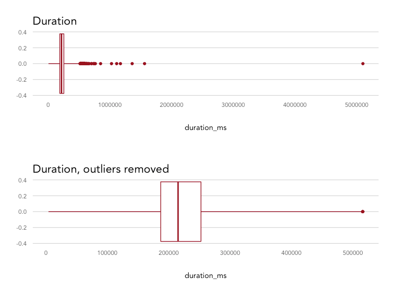
There were 116 songs that were defined as outliers and removed from the dataset, resulting in a distribution maxing out at 516,000 ms (8.6 minutes) instead of 5,100,000 ms (85 minutes).
Correlation between features
How do these features correlate with one another? Are there any that may be redundant?
playlist_songs_no_outliers %>%
  select(feature_names) %>%
  scale() %>%
  cor() %>%
  corrplot::corrplot(method = 'color',
                     order = 'hclust',
                     type = 'upper',
                     diag = FALSE,
                     tl.col = 'black',
                     addCoef.col = "grey30",
                     number.cex = 0.6,
                     col = colorRampPalette(colors = c(
                       kp_cols('red'),
                       'white',
                       kp_cols('dark_blue')))(200),
                     main = 'Audio Feature Correlation',
                     mar = c(2,2,2,2),
                     family = 'Avenir')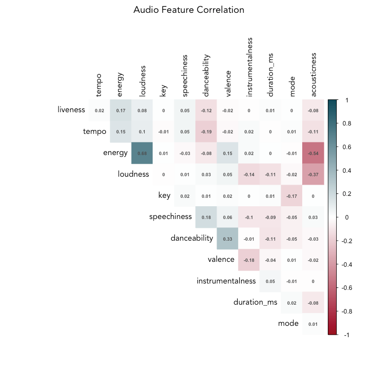
Across all songs and genres in the dataset, energy and loudness are fairly highly correlated (0.68). Let's remove loudness, since energy appears to give more distinction between genre groups (as seen in the density plot).
Energy and acousticness are negatively correlated, which makes sense, along with the positive correlation between danceability and valence (happier songs lead to more dancing). Liveness, tempo, and energy are clustered together, as are speechiness and danceability. Interestingly, danceability is negatively correlated with tempo and energy.
# remove loudness
feature_names_reduced <- names(playlist_songs)[c(12:14,16:23)]
Correlation within genres
How do the genres correlate with each other? We’ll calculate the median feature values for each genre and then compute the correlation between those to find out. This doesn’t take individual song variation into account, but will give us an idea which genres are similar to each other.
# average features by genre
avg_genre_matrix <- playlist_songs_no_outliers %>%
  group_by(playlist_genre) %>%
  summarise_if(is.numeric, median, na.rm = TRUE) %>%
  ungroup()

avg_genre_cor <- avg_genre_matrix %>%
  select(feature_names_reduced, -mode) %>%
  scale() %>%
  t() %>%
  as.matrix() %>%
  cor()

colnames(avg_genre_cor) <- avg_genre_matrix$playlist_genre
row.names(avg_genre_cor) <- avg_genre_matrix$playlist_genre

avg_genre_cor %>% corrplot::corrplot(method = 'color',
                     order = 'hclust',
                     type = 'upper',
                     tl.col = 'black',
                     diag = FALSE,
                     addCoef.col = "grey40",
                     number.cex = 0.75,
                     col = colorRampPalette(colors = c(
                       kp_cols('red'),
                       'white',
                       kp_cols('dark_blue')))(200),
                     mar = c(2,2,2,2),
                     main = 'Correlation Between Median Genre Feature Values',
                     family = 'Avenir')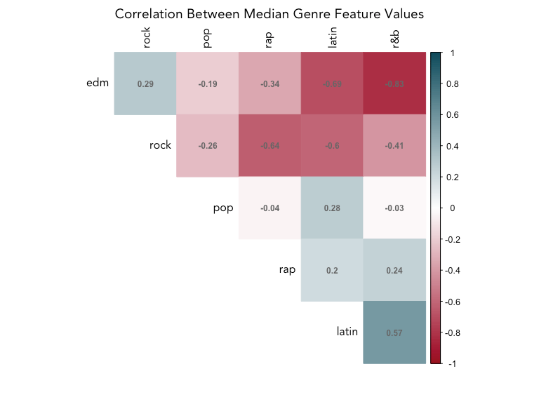
Rock and EDM is negatively correlated with all genres except for each other, which may make them easy to tell apart from the rest of the genres, but not each other. Latin and R&B are the most similar, with a positive correlation of 0.57, while EDM and R&B and EDM and latin are the most different (-0.83, -0.69).
Classifying songs into genres using audio features
Our first question was is it possible to classify songs into genres with just audio features; our secondary question is what can these audio features tell us about the distinctions between genre. With that aim, we should focus on classification models that are interpretable and provide insight into which features were important in organizing a new song into a given genre.
Classification algorithms that allow for greater interpretation of the features include decision trees, random forests, and gradient boosting.
Preparing the data for training
First, we'll scale the numeric features, and then split into a training set (80% of the songs) and a test set (20%).
playlist_songs_scaled <- playlist_songs_no_outliers %>%
  mutate_if(is.numeric, scale)

set.seed(1234)
training_songs <- sample(1:nrow(playlist_songs_scaled), nrow(playlist_songs_scaled)*.80, replace = FALSE)
train_set <- playlist_songs_scaled[training_songs, c('playlist_genre', feature_names_reduced)]
test_set <- playlist_songs_scaled[-training_songs, c('playlist_genre', feature_names_reduced)]

train_resp <- playlist_songs_scaled[training_songs, 'playlist_genre']
test_resp <- playlist_songs_scaled[-training_songs, 'playlist_genre']
Modeling
Decision tree
Decision trees are a simple classification tool that have an output that reads like a flow chart, where each node represents a feature, each branch an outcome of a decision on that feature, and the leaves represent the class of the final decision. The algorithm works by partitioning the data into sub-spaces repeatedly in order to create the most homogeneous groups possible. The rules generated by the algorithm are visualized in the tree.
The biggest benefit of decision trees is in interpretability - the resulting tree provides a lot of information about feature importance. They are also non-parametric and make no assumptions about the data. On the flip side, they are prone to overfitting and may produce high variance between models created from different samples of the same data.
set.seed(1111)
model_dt <- rpart(playlist_genre ~ ., data = train_set)

rpart.plot(model_dt,
           type = 5,
           extra = 104,
           box.palette = list(purple = "#490B32",
               red = "#9A031E",
               orange = '#FB8B24',
               dark_blue = "#0F4C5C",
               blue = "#5DA9E9",
               grey = '#66717E'),
           leaf.round = 0,
           fallen.leaves = FALSE,
           branch = 0.3,
           under = TRUE,
           under.col = 'grey40',
           family = 'Avenir',
           main = 'Genre Decision Tree',
           tweak = 1.2)
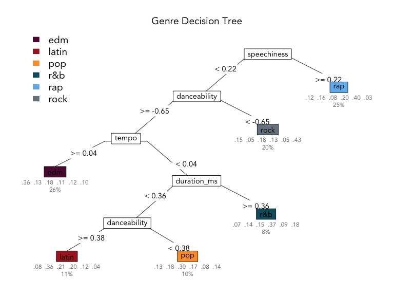
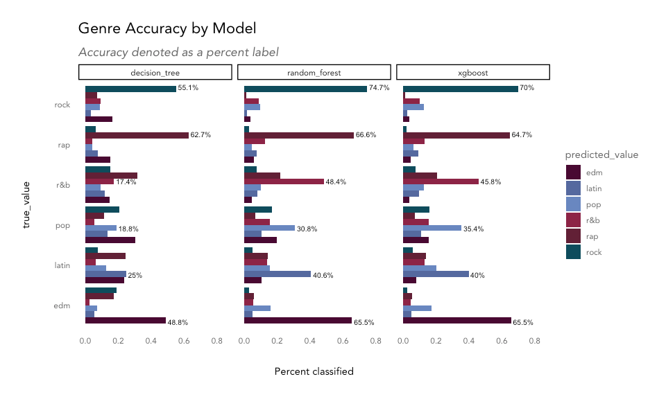
The most important feature in the decision tree model is speechiness, separating rap from the rest of the classes on the first decision. Next, tracks with low danceability are classified as rock; then, high-tempo tracks are labelled as EDM; next, longer songs are considered R&B, and then finally, songs with high danceability are grouped into the latin genre, and everything else is considered pop.
The values under the leaves represent the distribution of true values for each class grouped into that leaf; for example, in the rap predicted class, 12% were EDM, 16% were latin, 8% were pop, 20% were R&B, 40% matched the true value, rap, and 3% were rock tracks. The value beneath that indicates the percentage of observations classified into that leaf, so 25% of all tracks were classified as rap in this tree.
The decision tree classifier was best at classifying rock (43% correct) and rap (40% correct) and had the most trouble getting it right for pop tracks (30% correct) in the training data. How does it perform on the hold-out test data?
predict_dt <- predict(object = model_dt, newdata = test_set)
max_id <- apply(predict_dt, 1, which.max)
pred <- levels(as.factor(test_set$playlist_genre))[max_id]

compare_dt <- data.frame(true_value = test_set$playlist_genre,
                         predicted_value = pred,
                         model = 'decision_tree',
                         stringsAsFactors = FALSE)

model_accuracy_calc <- function(df, model_name) {
  df %>%
    mutate(match = ifelse(true_value == predicted_value, TRUE, FALSE)) %>%
    count(match) %>%
    mutate(accuracy = n/sum(n),
           model = model_name)
}

accuracy_dt <- model_accuracy_calc(df = compare_dt, model_name = 'decision_tree')
The decision tree model shows an overall accuracy, or percentage of songs classified into their correct genre, of 37.9%.
Random forest
Random forests are an ensemble of decision trees, aggregating classifications made by multiple decision trees of different depths. This is also known as bootstrap aggregating (or bagging), and helps avoid overfitting and improves prediction accuracy.
We'll run a random forest model with 100 trees to start, and then take a look at the variable importance.
model_rf <- randomForest(as.factor(playlist_genre) ~ ., ntree = 100, importance = TRUE, data = train_set)

predict_rf <- predict(model_rf, test_set)

compare_rf <- data.frame(true_value = test_resp,
                         predicted_value = predict_rf,
                         model = 'random_forest',
                         stringsAsFactors = FALSE)

accuracy_rf <- model_accuracy_calc(df = compare_rf, model_name = 'random_forest')
The random forest model shows overall accuracy of 54.3%.
Gradient boosting with XGBoost
The next round of improvements to the random forest model come from boosting, or building models sequentially, minimizing errors and boosting the influence of the most successful models. Adding in the gradient descent algorithm for minimizing errors results in a gradient boosting model. Here, we'll use XGBoost, which provides parallel processing to decrease compute time as well as various other improvements.
We'll use the xgboost function with most of the default hyperparameter settings, just setting objective to handle multiclass classification.
matrix_train_gb <- xgb.DMatrix(data = as.matrix(train_set[,-1]), label = as.integer(as.factor(train_set[,1])))
matrix_test_gb <- xgb.DMatrix(data = as.matrix(test_set[,-1]), label = as.integer(as.factor(test_set[,1])))

model_gb <- xgboost(data = matrix_train_gb,
                    nrounds = 50,
                    verbose = FALSE,
                    params = list(objective = "multi:softmax",
                                  num_class = 6 + 1))

predict_gb <- predict(model_gb, matrix_test_gb)
predict_gb <- levels(as.factor(test_set$playlist_genre))[predict_gb]

compare_gb <- data.frame(true_value = test_resp,
                         predicted_value = predict_gb,
                         model = 'xgboost',
                         stringsAsFactors = FALSE)

accuracy_gb <- model_accuracy_calc(df = compare_gb, model_name = 'xgboost')
The gradient boosting model shows overall accuracy of 53.6%.
Model comparison
Variable importance
importance_dt <- data.frame(importance = model_dt$variable.importance)
importance_dt$feature <- row.names(importance_dt)

# mean decrease in impurity
importance_rf <- data.frame(importance = importance(model_rf, type = 2))
importance_rf$feature <- row.names(importance_rf)

# gain
importance_gb <- xgb.importance(model = model_gb)

compare_importance <- importance_gb %>%
  select(Feature, Gain) %>%
  left_join(importance_dt, by = c('Feature' = 'feature')) %>%
  left_join(importance_rf, by = c('Feature' = 'feature')) %>%
  rename('xgboost' = 'Gain',
         'decision_tree' = 'importance',
         'random_forest' = 'MeanDecreaseGini')

compare_importance %>%
  mutate_if(is.numeric, scale, center = TRUE) %>%
  pivot_longer(cols = c('xgboost', 'decision_tree', 'random_forest')) %>%
  rename('model' = 'name') %>%
  ggplot(aes(x = reorder(Feature, value, mean, na.rm = TRUE), y = value, color = model)) +
  geom_point(size = 2) +
  coord_flip() +
  labs(title = 'Variable Importance by Model',
       subtitle = 'Scaled for comparison',
       y = 'Scaled value', x = '') +
  scale_color_kp(palette = 'cool')
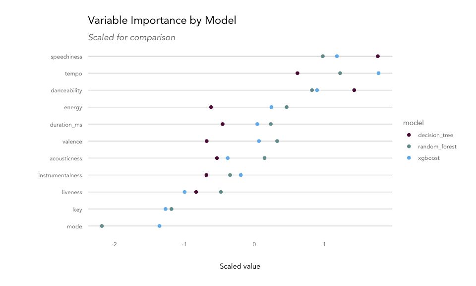
Each model uses a different measure for explaining variable importance. Decision trees provide a score for each feature based on its usefulness in splitting the data. For a random forest, we can use mean decrease in node impurity, which is the average decrease in node impurity/increase in node purity resulting from a split on a given feature. For XGBoost, we can use gain, or the improvement in accuracy contributed by a given feature. For all features, the top-ranked feature is typically the most common root node in the tree(s) as they tend to create the biggest reduction in impurity.
The most important variable for the decision tree model was speechiness, while the random forest and XGBoost models found tempo to be the most useful. Danceability, energy, duration, and valence were also found to be important features for separating songs into genres, while mode and key didn't contribute much.
Accuracy
accuracy_rf %>%
  rbind(accuracy_dt) %>%
  rbind(accuracy_gb) %>%
  filter(match == TRUE) %>%
  select(model, accuracy) %>%
  mutate(accuracy = percent(accuracy,2)) %>%
  knitr::kable()
| model | accuracy |
| decision_tree | 37.86% |
| random_forest | 54.32% |
| xgboost | 53.56% |